GAVI: A New Brand

[ Updated 11.19.14 — please see note at the end. ]
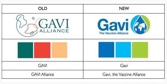
This summer, without announcement or fanfare, Gavi introduced a new brand. Here is a comparison of some of the changes.

The new logo has a map/globe oriented directly on Africa. The old logo appears to have a globe with Africa to the left in green and India, in the forefront, in red. Or is it? What I liked about the old logo was the ambiguity of it; those irregular forms might have been continents, but they could just as easily have been vaccine-induced antibodies contained within the green border of a cell. The fact that the circle wasn’t completed and the shapes overlapped the name gave it a fresh and unconventional look, whereas the new logo looks precise, structured, and highly conventional.
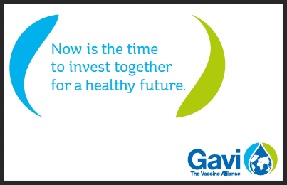
To reinforce the impression of the new logo, its two outside “arms” (one of them inverted) are used on the website and in reports as brackets surrounding pull-quotes:

The color shift from soft and warm to sharp and cool fits with the shift to greater convention. The green and red from the old logo represent the widest possible span, sitting on opposite sides of a color wheel. The blues and greens of the new logo all reside in one quadrant of the wheel. Again, reflecting focus.
With a lead capital G and lower case avi, the Alliance’s name is no longer an acronym. Originally it was the Global Alliance for Vaccines and Immunisations, then most recently the GAVI Alliance, and now Gavi, the Vaccine Alliance. So vaccine is again explicitly part of the name. But the upper/lower-case spelling is sure to further muddle search results, returning countless entries for products of Italy’s Piedmont region; Gavi wine, Gavi shoes, etc.
There are of course a number of other changes: the logo wording changed from a serif font to sans-serif, the background shading shifted from a warm tan to white, Vaccines (plural) became Vaccine (singular), etc.
The old logo was created by the agency Saatchi & Saatchi (Geneva). As far as I can see, no agency has yet taken credit for the new logo. In fact, the only mention I can find is this line from the Alliance’s June 18–19, 2014 Board Meeting:
The Chair referred briefly to the new GAVI brand which had been presented during dinner on the previous evening and thanked the CEO for ensuring that the new logo had been developed in a cost efficient way.
So, on the whole, what do we make of it? The new branding is certainly well and professionally executed, both on the website and in recently produced documents. It has a crisp and substantive appearance. But the logo itself lacks the character and originality of the original. It’s too bad some aspects of it could not have been retained.
On November 18, 2014, Pascal Barollier, Gavi’s Director of Media and Communications, wrote:
Thank you for your interest in Gavi’s new visual identity. To find out a bit more about the rationale behind Gavi’s brand evolution I would suggest reading the Devex article linked below:
https://www.devex.com/news/the-evolution-of-global-health-s-best-kept-secret-84782
To answer your question, the creative agency supporting Gavi’s new visual identity was Carré Noir, a subsidiary of Publicis Group with a solid track-record of creating or strengthening global brands.
The new visual identity was launched in August 2014 along with a refreshed website containing new illustration of Vaccine Alliance partners impact on the ground. We also designed and launched a new blog www.vaccineswork.org focused on immunisation and global health with the objective of providing a platform for Gavi partners to publish first-hand accounts of their effort to reach every child with life-saving vaccines.
Again, Rick, thank you for your interest and the opportunity to contribute to your blog.
Best regards,
Pascal